I found a great company, with a stellar track record, run by great people. So I went looking for a way to improve their marketing/sales assets.
I've redacted the company's name because I'm not here to point fingers. I'm here to suggest ways to improve the return on whatever time and money this company puts into marketing.
The Original Opt-In Page
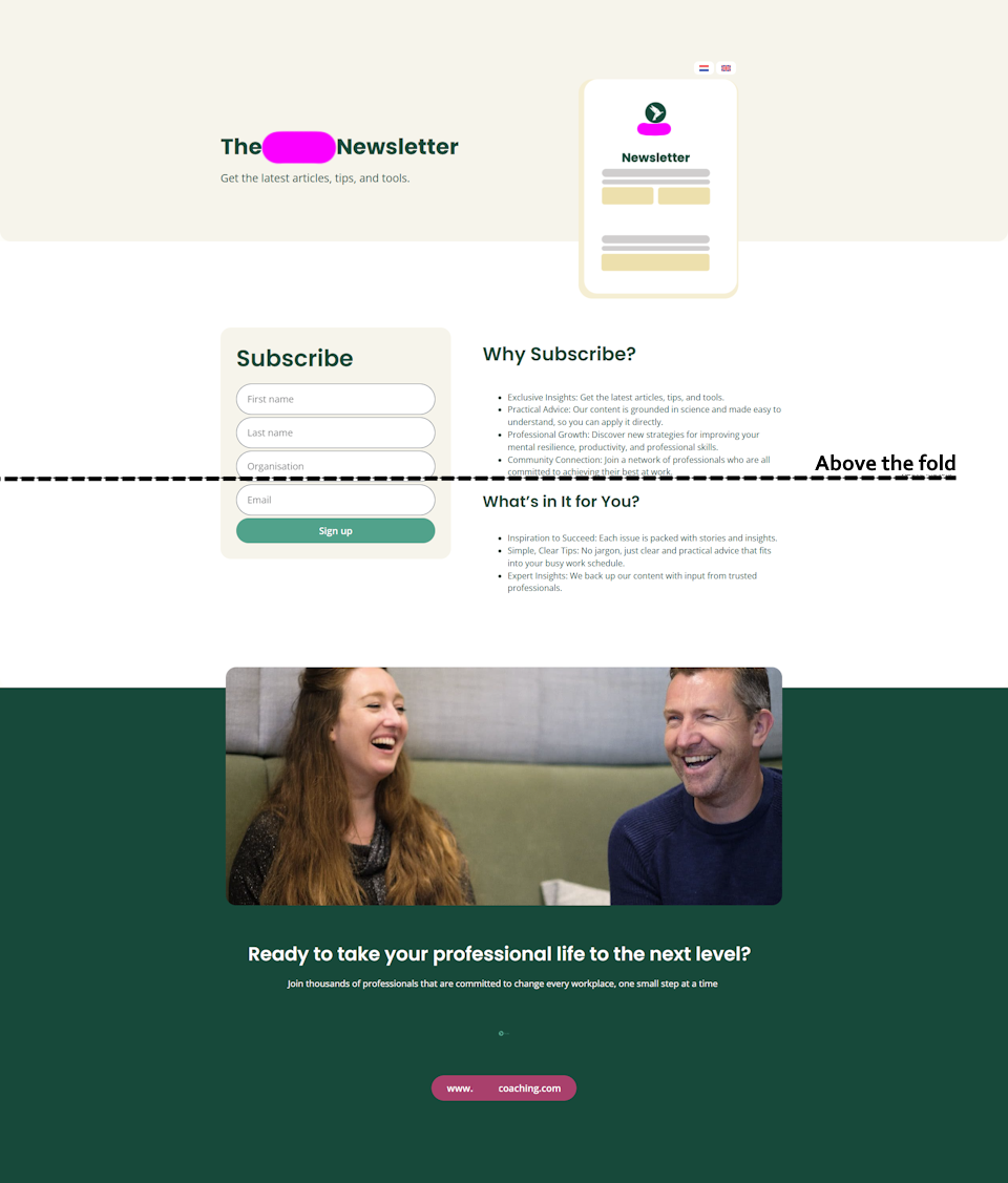
Potential issues:
- Almost all the of above-the-fold real estate is used on color blocks not helpful copy
- Opt-in button is below the fold, that means the prospect has to scroll to find it.
- Somewhat generic looking value proposition
- The Hero Image is a small logo on an illustration that looks like a small opt-in page. Not an aspirational illustration or something that builds intrigue/desire/identity
- "Why subscribe" and "What's in it for you" are functionally the same thing. One of those crossheads is redundant.
- Personal pet peeve: "Take Your ... To The Next Level" is a copywriting cop-out when you don't accuratetely know what your target prospects really want. Better research will fix that in a few hours of work and it'll make your copy way more resonant.
- There are two links at the bottom that take the reader back to the company website. If this is meant as a squeeze page, then we'll want to keep the attention ratio at 1:1. The only thing the prospect can click is what we want them to click.
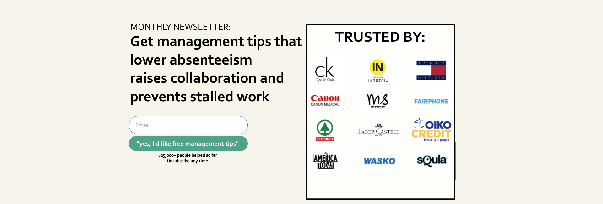
The Suggested (Simplified) Opt-in Page:
Minimal. Simplified. Stronger proof. Better focus. Specifics about the monthly offering. Value prop that aligns with the company's LinkedIn content.
Reasoning behind the suggested changes
- I’ve loosely based the headline suggestion on the company's LinkedIn posts, since that seems to be where they’re driving traffic from. That way the landing page feels resonant with the last bit of content the lead saw before clicking though to this landing page.
- This version has more proof. Both in the sidebar and underneath the button itself (This company has AMAZING collaborations, might as well show them off 🙂). This is because LinkedIn content already builds “know/like”. People mostly just need to feel safe opting in once they’ve landed on your opt-in page (to complete the know/like/trust triangle).
- The headline is intentionally formatted so the first words a skimmer will see (the headlines’ left-most words) are: lower, raise, and prevent. That’s intentional 🙂
- Value proposition/headline that speaks to benefits for the prospect. I’ve taken the topics from the company Q&A to ensure congruence between the main page and opt-in. (Based on your hundreds of thousands of clients, you know exactly the main challenges they have, so obviously speak directly to those if you can).
- Everything on this alternative page is above the fold - no need to scroll to opt in. On mobile any scrolling will lead to the side bar with proof.
- ON MOBILE ONLY: Add another identical opt-in box to the bottom of the page so scrollers will pass over the proof bar and then hit another chance to opt in.
- Simplified opt-in process. The original opt-in form asks for 4 questions. Email-only makes it easier for people to join (you can always add fields later if really want to disqualify more people from signing up).
- Opt-in button in now a "call to value", rather than a call to action. Button text is written to be congruent with the headline. If the headline/value prop changes, so does the button copy.
- Spelling out it’s a monthly newsletter in the eyebrow copy so the prospect knows exactly what they’re getting.
- There is only one button on the page, which leaves no way to navigate back to your main site. This keeps the attention on the opt-in only.
- “Click triggers” (the small text under the button) are there to build trust.
NOTE: It would be worth testing a really ugly button color. Buttons that stand out have often shown improved opt-in rates. As a matter of fact: The uglier the better, but this time I didn’t want to suggest messing with the branding/color scheme.
If this is YOUR opt-in page, please feel free to test the alternative opt-in page out, and see if it has higher conversion rates (and leads to more email revenue).