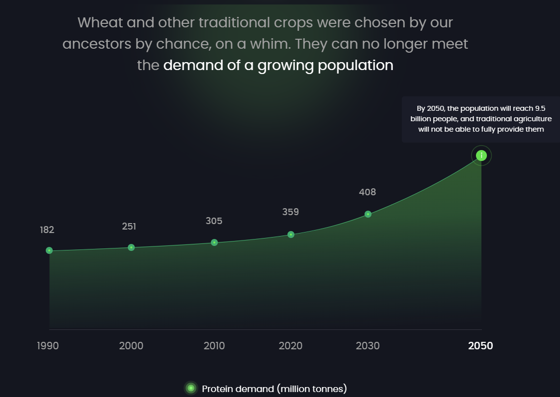
Below is a screenshot from a company that makes bioreacters. They're able to grow a type of plant that has up to 40% protein in dry weight. Obviuosly this is great, because current Ag can't produce enough protein to meet worldwide demands in the future.
To highlight why their tech is vital they use this graph:

The issue, as I see it, is that the last dot shouldn't be green, but red. To signal danger.
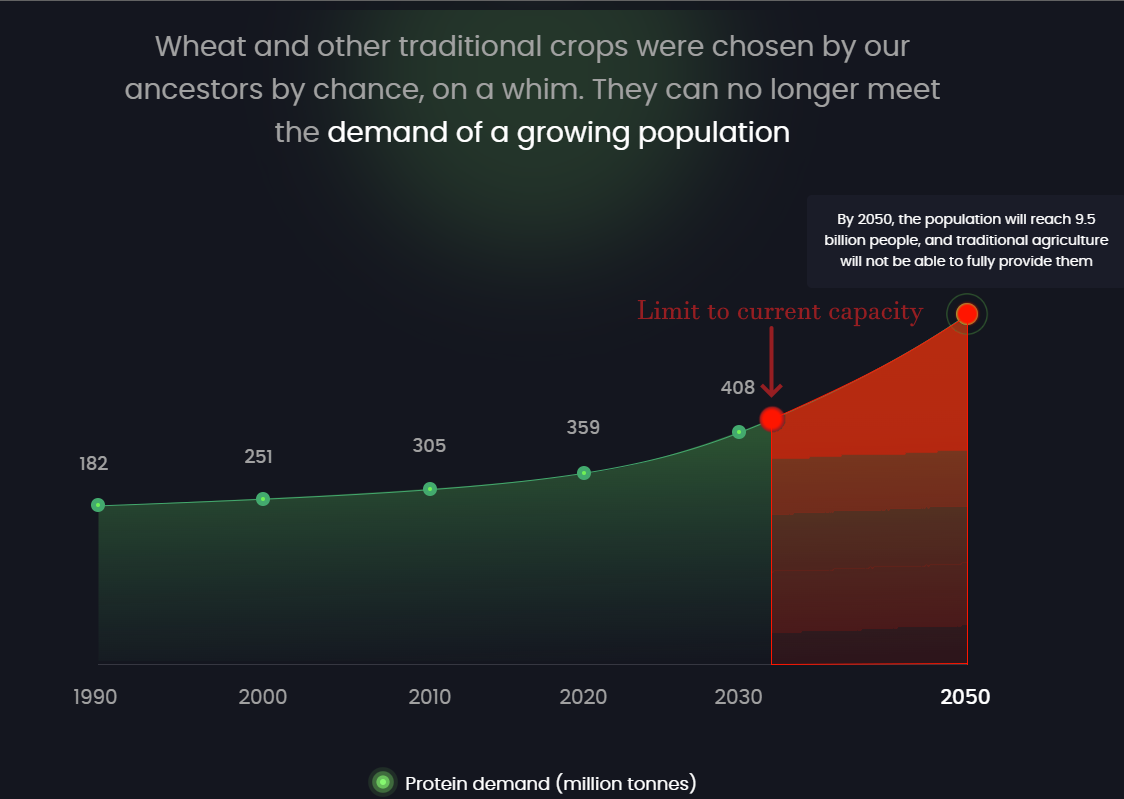
In fact I think they could go even further so that the entire graph outlines the real scope of the problem, by showing the exact time in the future when we can't meet out protein needs.
Also: Use more red. 😂
Here's What I'd Suggest (Roughly):
Since the graph is meant to communicate that we're running out of capacity to produce protein, why not put the expected limit to prodution on there, as a visual element?

This way the viewer can look at the graph and go:
"Well, damn! We're running out of plant-based protein from 2032 and onwards. I think I see the problem here."
-The reader's inner monologue
"A picture tells a 1000 words - Copy tells the reader which of those 1000 words to focus on."
Got Something Deadly Serious You Want To Communicate To Your Prospects?
Hop on a call and ask your questions, I'm here for you.
(The link above outlines how I'm able to help)